

Raising the profile of a worldwide software provider in the Italian library community.
Quick stats: 48% increase in average session durations, 74% decrease in bounce rate and 77% increase in form enquiries within the first six months of launch.
OCLC is a global nonprofit organisation that provides shared technology services, original research, and community programs for libraries worldwide. Founded in 1967, OCLC connects thousands of libraries in over 100 countries, enabling them to collaborate on cataloguing, resource sharing, and discovery services. OCLC’s mission is to make information more accessible and useful through collective library cooperation.
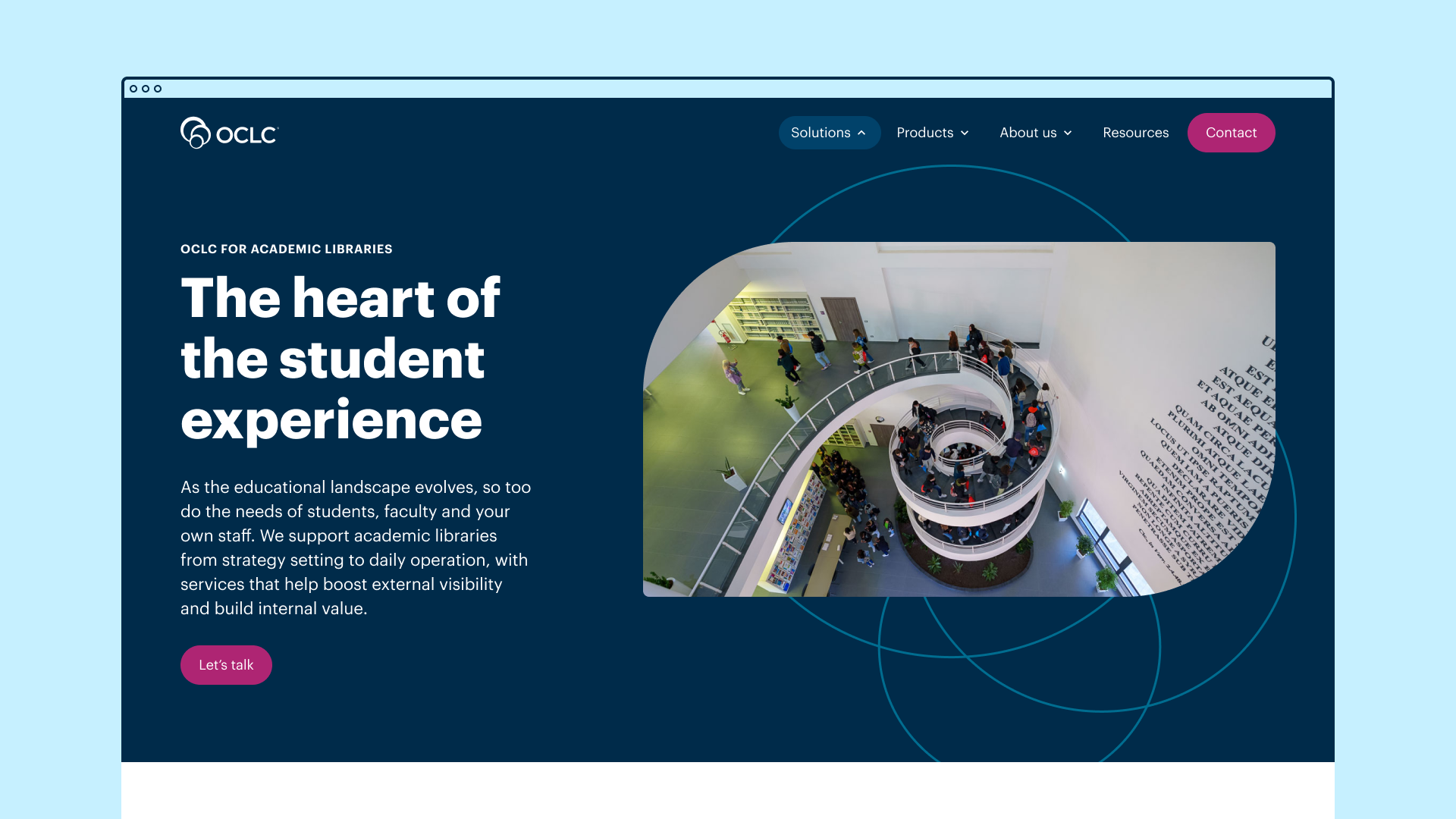
OCLC has teams around the world that support libraries in their respective countries. The Italian team approached us with a goal: to raise their profile within Italy’s library community. While we needed to stay true to OCLC’s established parent brand, the team wanted to infuse the identity with a distinctively Italian character - one that reflected not only the country’s rich cultural heritage, but also the unique spirit of their home city, Florence.
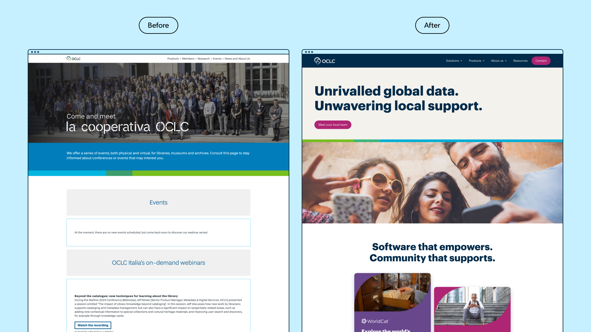
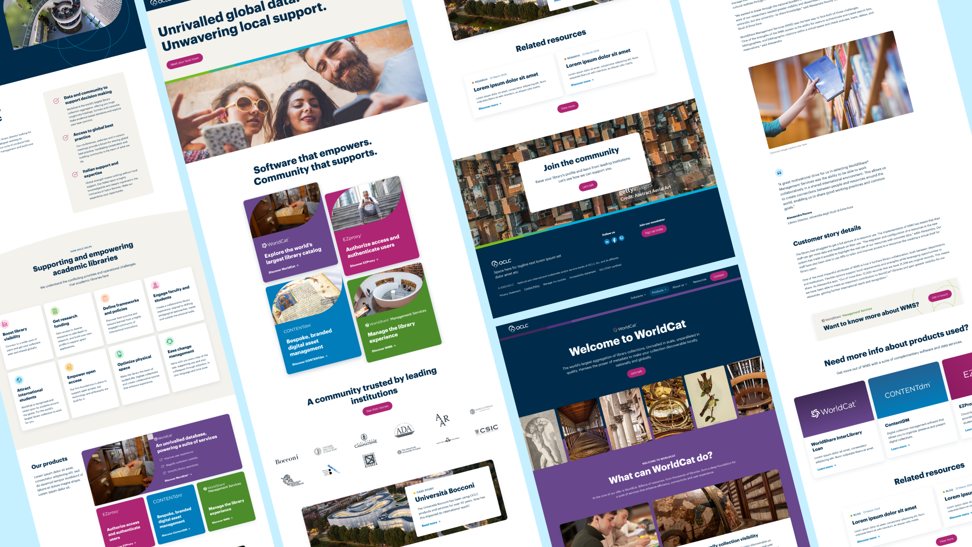
The existing Italian microsite was lacking in detail about the capabilities of the services and software OCLC provides worldwide. It also lacked the credibility it prides itself on, OCLC serves some of the most prestigious universities and cultural institutions in the world, but lacked the evidence points and substantial case studies they deserved.
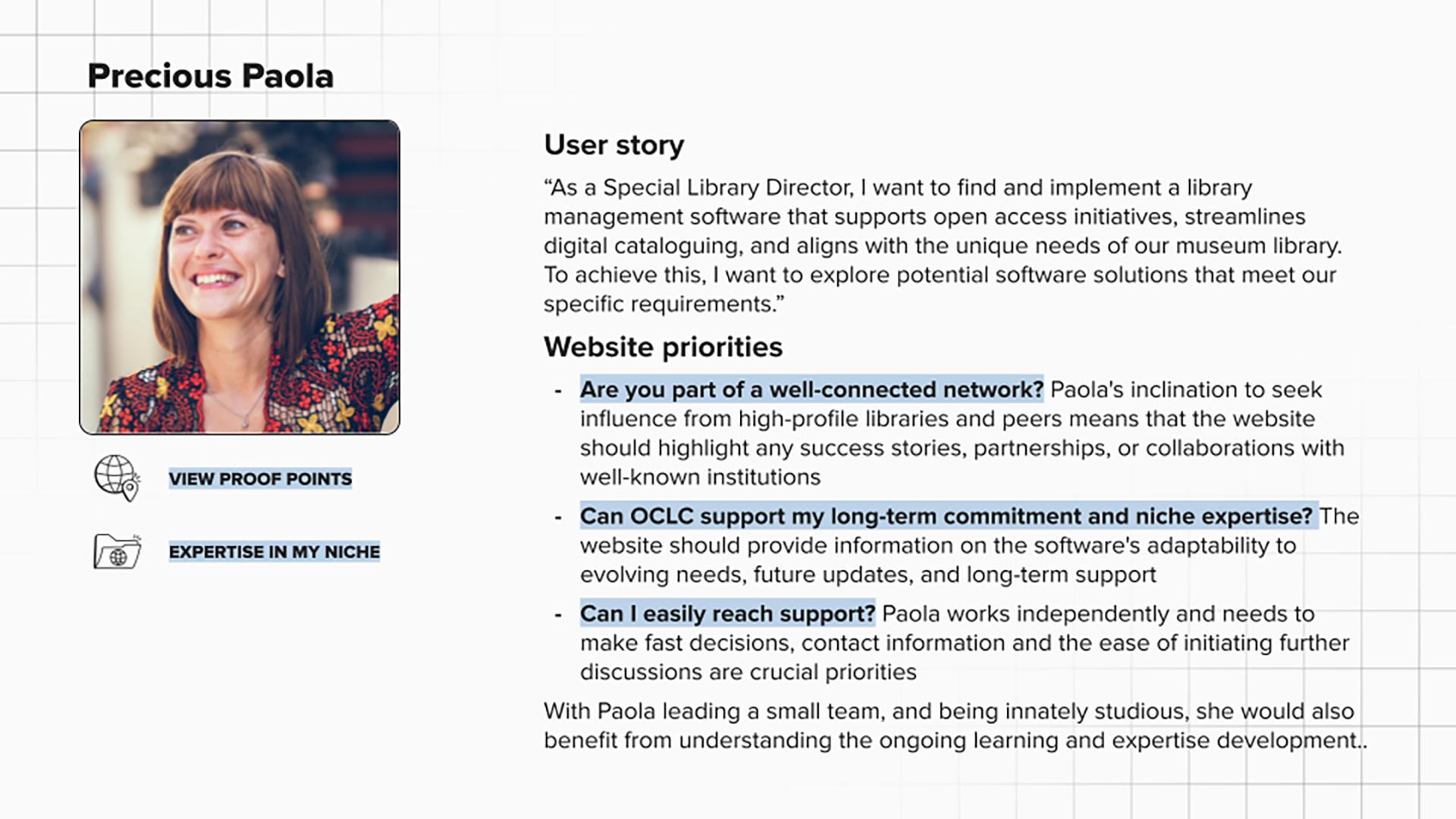
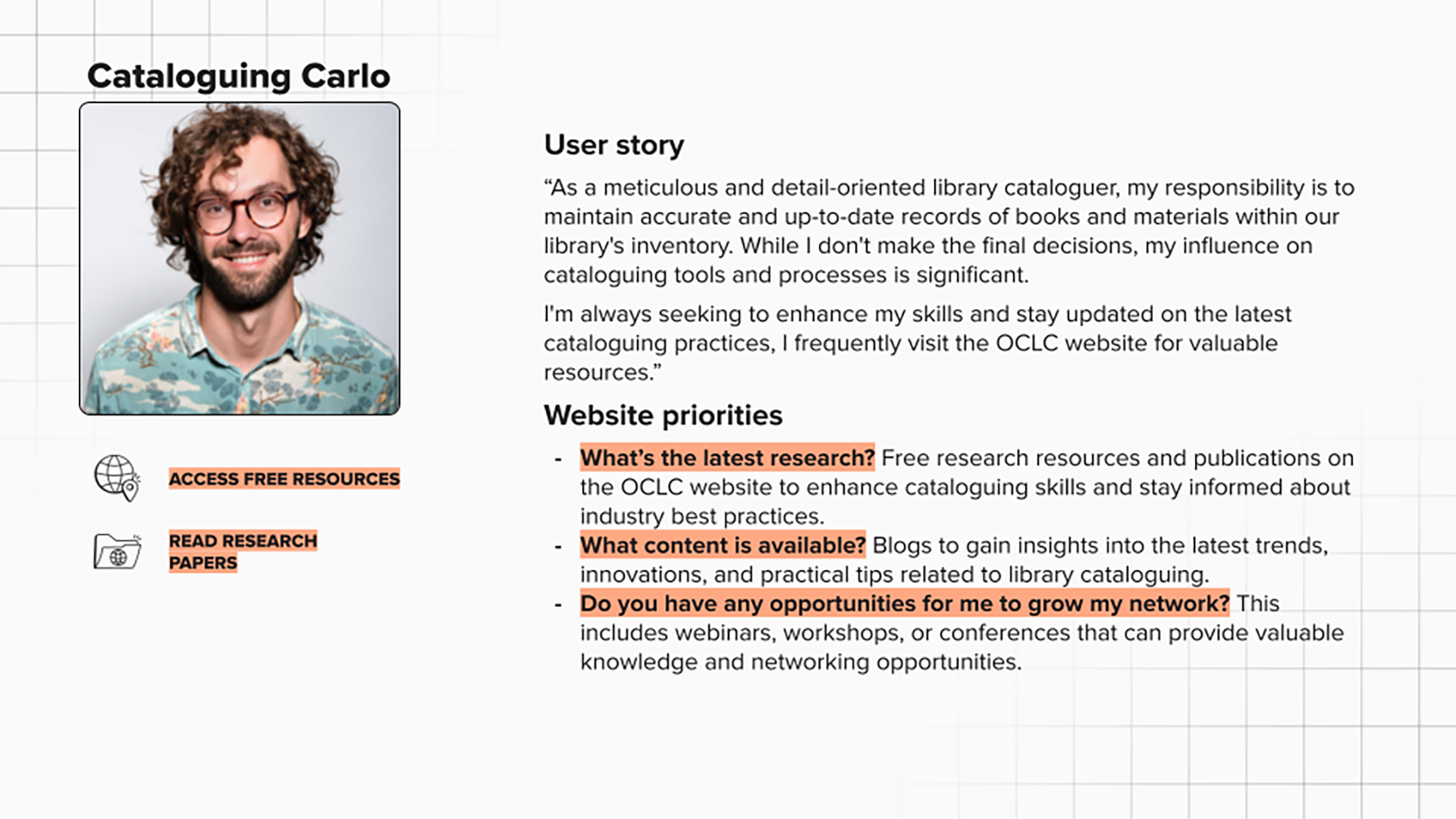
During the insights phase, we ran workshops with the Italian team to identify the key personas the website needed to engage. Three stood out: two leadership figures - Analytical Analisa and Precious Paola - and an influential peer, Cataloguing Carlo. Analisa and Paola were primarily focused on understanding how OCLC supports the global library community, as well as how it would assist them in adopting the software locally. While Carlo wasn’t a final decision-maker, he played a significant role in influencing leaders like Analisa and Paola. For users like Carlo, thought leadership content would be essential - providing the insight and evidence needed to help him advocate for OCLC internally.
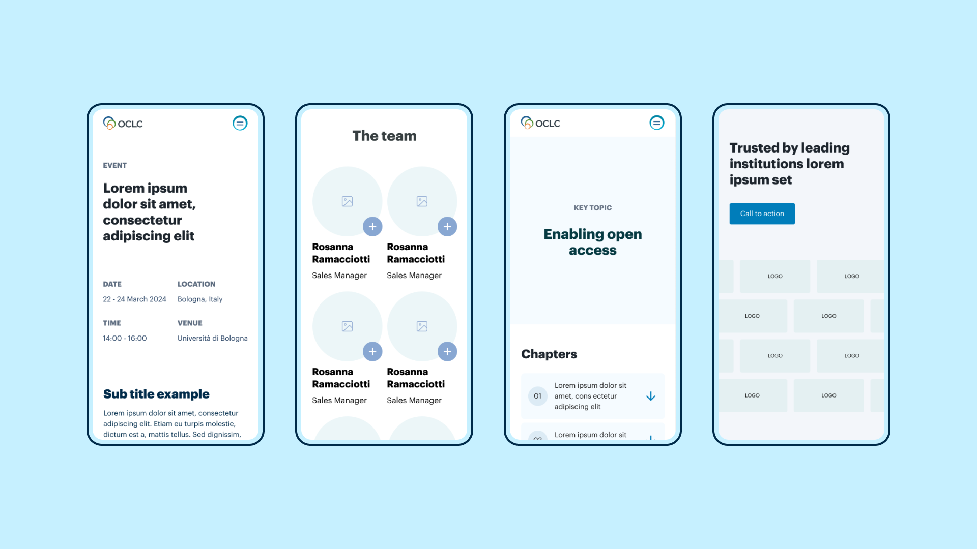
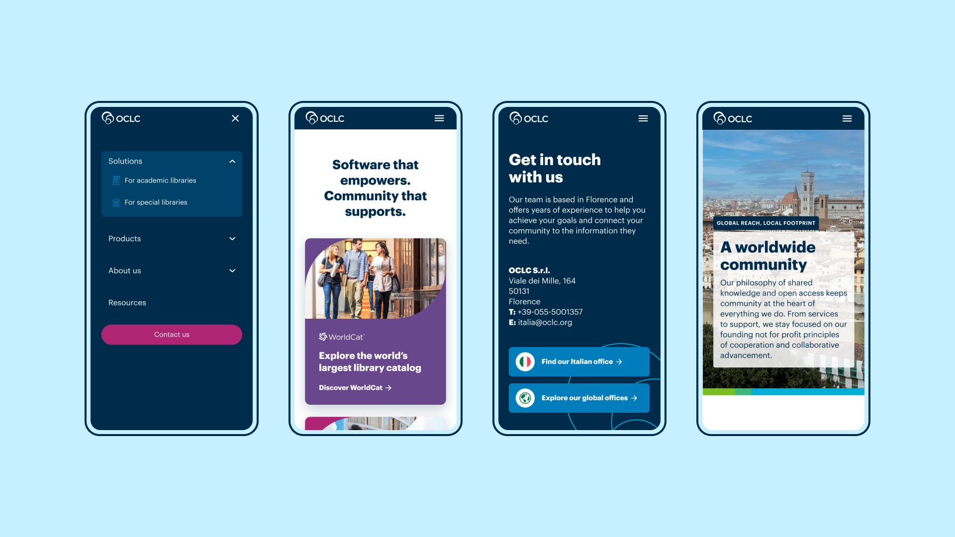
Another challenge was the requirement to build the website using Pardot landing pages. Although an unconventional approach that comes with some front- and back-end limitations, we embraced it as a team and were ready to find creative solutions within those constraints.
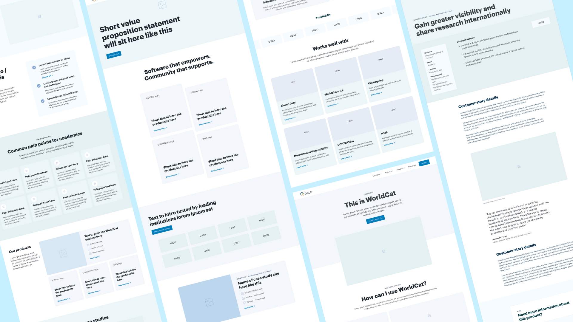
The previous site was relatively lean on technical detail, and after observing some competitors' use of downloadable technical resources, we wanted to test the engagement levels of similar content on the new product pages. Through session recordings and follow-up interviews with users representing our target personas, we found that these technical sections were often “cluttering the page” and causing users to overlook more valuable content further down, such as case studies. Common feedback included: “I don’t need this much information now,” “it’s too complicated for now,” and “I just need the highlights right now.”
We also tested the effectiveness of enquiry forms placed directly on the individual solution and product pages to assess whether introducing them earlier in the user journey would improve conversion rates. However, only 33% of users completed these forms. When we followed up with those who did not, the most common responses were: “It’s a distraction at this point – I just want to do my research,” “I’m not ready yet,” and “Too many questions – I’d prefer to provide more detail later on in a meeting.”
As a result, we simplified the enquiry form to include only essential fields and relocated it to the main Contact page, which all CTAs from the solution and product pages now direct to.
Rather than overwhelming the solution and product pages with dense technical content, we focused on clearly communicating the benefits of OCLC’s services and how the organisation already supports a wide range of institutions. This was achieved through easy-to-digest content blocks and comprehensive case study sections. Our user testing revealed that in-depth technical information becomes more relevant further down the marketing funnel – once users have taken the initial step of making an enquiry.
To reinforce OCLC’s role as more than just a software provider, we integrated valuable resources – such as research papers and webinars – across the site. This positioned the brand as a trusted leader in knowledge sharing, a core element of the OCLC ethos. These resources also spoke directly to the needs of personas like Carlo, who value thought leadership content that can help them stay informed, build internal advocacy, and influence decision-makers within their institutions.
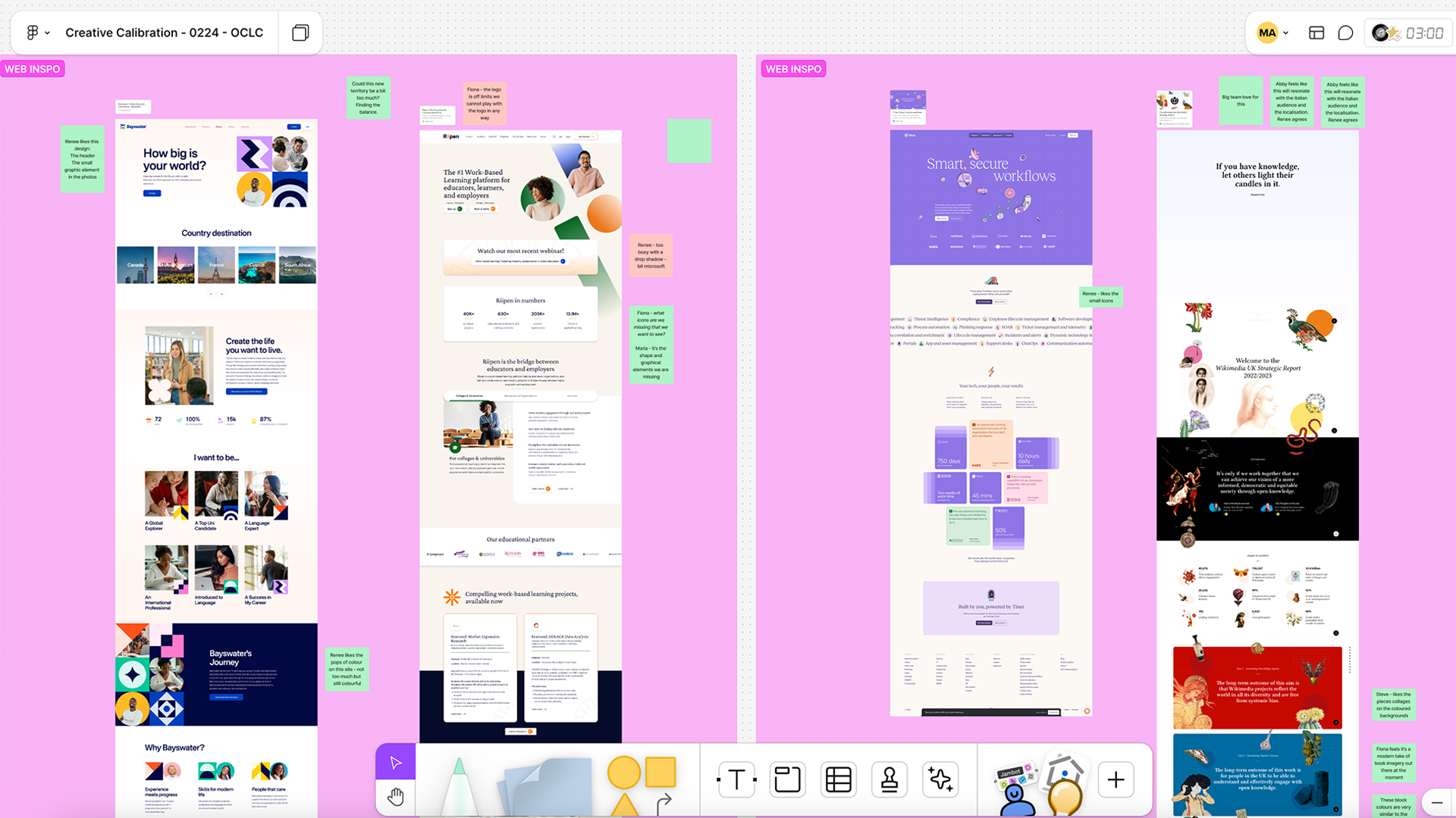
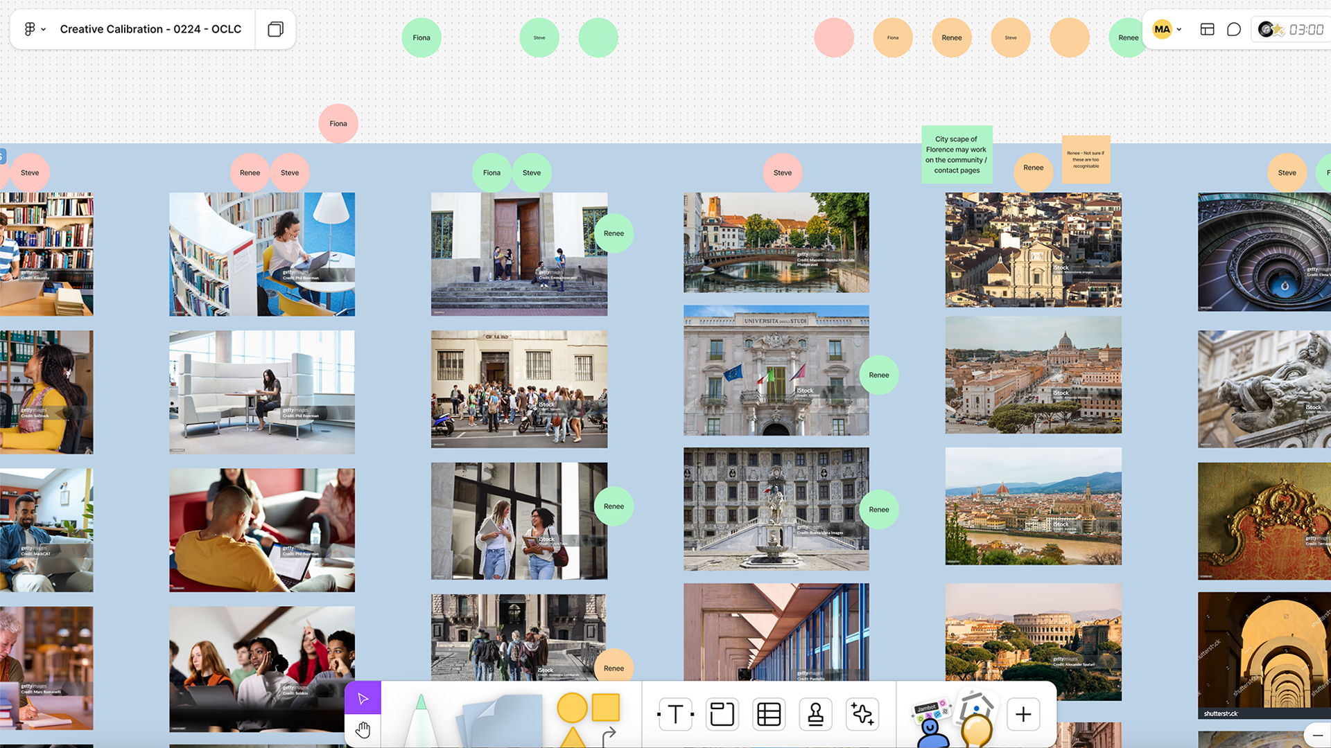
While the core OCLC brand was consistently applied throughout the UI, creative calibration sessions with the Italian team allowed us to introduce a distinct twist that celebrated Italian heritage and applied the parent brand in a fresh, previously unexplored way. These sessions also gave us the opportunity to brief a photographer to capture original imagery of some of the academic and special libraries OCLC partners with in Florence and across Italy. These visuals were then used throughout the site to create a more localised and authentic experience.
Throughout the process, we developed a design system that not only supports the ongoing growth of the OCLC Italia site but also serves as a flexible foundation for future microsites created by other local OCLC teams.
OCLC Italia received positive feedback from both OCLC HQ and respective local teams internationally on the launch of the new website, sparking conversations within other local teams to rejuvenate their own micro sites.
OCLC Italia also saw a 48% increase in average session durations, 74% decrease in bounce rate and 77% increase in form enquiries within the first six months of launch.
Crafted and coded at Don’t be Shy.